The Mobile-First SEO Audit: Why Agencies Miss Screen Optimization Before Ranking Recovery
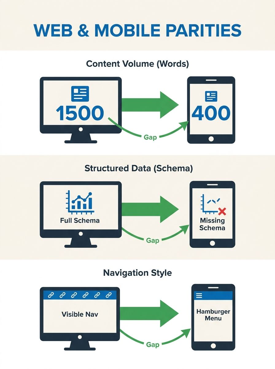
A desktop page carrying 1,500 words and rich schema markup that renders as a 400-word stripped-down version on mobile will rank based on the thin mobile version, because Google indexes mobile, not desktop.
 Marcus Webb··11 min read
The Mobile-First SEO Audit: Why Agencies Miss Screen Optimization Before Ranking Recovery
A desktop page carrying 1,500 words and rich schema markup that renders as a 400-word stripped-down version on mobile will rank based on the thin mobile version, because Google indexes mobile, not desktop. This mobile SEO audit framework walks you through nine steps in 3–4 hours and catches the responsive design SEO gaps most agencies skip before attempting ranking recovery.
Before You Start
You need five things in place before step one. Missing any of them introduces gaps that compound across the audit.
Google Search Console access with at least 90 days of data. The Mobile Usability Report and Core Web Vitals report are essential starting points. Google's Core Web Vitals report links to external testing tools for additional page-level diagnostics you'll need in step 2.
A physical smartphone, a real device, not a browser emulator. Google's own mobile-first indexing documentation recommends real-device testing because emulators miss rendering quirks, touch target sizing, and actual network latency.
PageSpeed Insights access, PSI reports on user experience for both mobile and desktop, and its Core Web Vitals assessment (LCP, CLS, INP) determines overall page experience quality scores.
A spreadsheet or audit template to log findings per page, per device width. You'll be comparing desktop versus mobile versions of your top 20 organic landing pages.
Time: 3–4 hours for a site with under 500 pages. Enterprise sites with 10,000+ pages require 8–12 hours across multiple sessions.
Your knowledge level should include basic familiarity with Google Search Console, an understanding of what Core Web Vitals measure, and the ability to view page source on a mobile browser. If you need a primer on audit tooling and pricing tiers, there's a breakdown of leading audit platforms that covers budget-appropriate options.
Step 1: Establish the Desktop-to-Mobile Content Gap
The single most damaging mobile SEO failure is content parity loss, desktop pages carrying content, structured data, or internal links that vanish on mobile. Since Google indexes the mobile version, anything missing from mobile is invisible to the ranking algorithm. A UK-based travel agency lost 55.5% of its mobile rankings due to mismatched content between desktop and mobile versions, costing an estimated $133,200 in monthly revenue.
Pull up your five highest-traffic pages on both a desktop browser and your physical smartphone. Compare them side by side for:
Word count: A page with 1,500 words on desktop that renders 400 words on mobile is ranking as a thin page. Count the words visible without expanding any accordions or tabs.
Heading structure: Every H1 through H6 on desktop must appear on mobile. Missing headings strip topical signals from the indexed version.
Structured data: Check whether schema markup (review schema, FAQ schema, product markup) renders identically. Agencies frequently deploy schema only on desktop templates, a problem we covered in depth when looking at how review schema gets missed.
Internal links: Navigation changes dramatically between desktop and mobile on responsive designs, creating SEO risks that developers overlook. Hamburger menus hide links from immediate view, reducing the crawl paths Googlebot sees.
You'll know it worked when: You have a spreadsheet row for each of your top 20 pages showing word count (desktop), word count (mobile), missing headings, missing schema, and missing internal links. Any page with a content gap greater than 15% needs remediation before you touch anything else.
Step 2: Run Core Web Vitals on Mobile, Not Desktop
Core Web Vitals are the performance metrics that determine overall page experience quality. The thresholds that matter are the mobile ones:
Largest Contentful Paint (LCP): Under 2.5 seconds
Interaction to Next Paint (INP): Under 200 milliseconds
Cumulative Layout Shift (CLS): Under 0.1
Run every page from your top-20 list through PageSpeed Insights with the mobile toggle selected. Record the actual numbers, not just the pass/fail indicator. A page scoring 2.4 seconds LCP is passing today but sitting on the edge of failure after any infrastructure change.
The Reddit PPC community documented a case where a site started at 38 mobile performance and climbed to 50+ on PageSpeed Insights, meaningful progress, but still well short of what competitive SERPs require. And 63.31% of all web traffic comes from mobile devices, according to SEOmator's analysis, so these mobile numbers determine the experience for the majority of your audience.
You'll know it worked when: Your spreadsheet now has LCP, INP, and CLS values for each of 20 pages on mobile. Any page with LCP above 2.5 seconds or CLS above 0.1 gets flagged for immediate technical investigation.
Step 3: Audit Touch Targets and Tap Spacing
Search engines use indicators like bounce rate, time on page, and pages per session as ranking signals. When users can't tap what they intend to tap, every behavioral metric degrades simultaneously. Google Search Console's Mobile Usability report flags three specific touch-target problems:
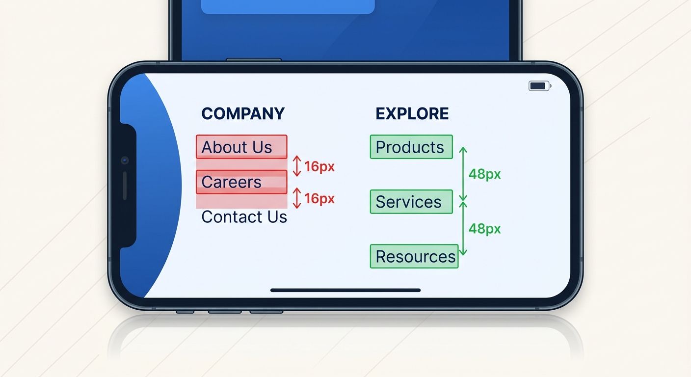
Clickable elements too close together: Any two tappable elements within 8 pixels of each other fail. Footer link stacks are the most common offender.
Content wider than screen: Horizontal scrolling on mobile kills engagement and triggers usability errors in Search Console.
Text too small to read: Below 16px on a 5.5–6 inch screen (the dominant smartphone size range), users pinch-zoom, which Google interprets as a usability failure.
Walk through your top 20 pages on your smartphone and attempt every call-to-action, every navigation link, and every form field. Log each instance where you mis-tap, need to zoom, or can't find a button that's clearly visible on desktop.
You'll know it worked when: You have a list of specific URLs with specific tap-target failures, each tagged with the element description and the approximate screen position. An agency that delivers "mobile usability: pass" without this granularity has done a surface-level check.
Step 4: Check Viewport and Responsive Breakpoint Behavior
Responsive design means your CSS adapts to screen width, but responsive design creates fewer SEO problems than a separate mobile site only when the breakpoints are configured correctly. The audit here targets the gaps between breakpoints, the screen widths where layouts break in ways nobody tested.
Test each of your top 20 pages at these five specific widths:
Width | Representative Devices | Approximate Traffic Share |
|---|---|---|
320px | Older small phones | ~4% of mobile traffic |
375px | iPhone SE, iPhone 12 Mini | ~18% of mobile traffic |
390px | iPhone 14, iPhone 15 standard | ~22% of mobile traffic |
412px | Samsung Galaxy S series | ~19% of mobile traffic |
768px | Tablets, iPad Mini | ~8% of mobile traffic |
At each width, check for text overflow or horizontal scroll, images that exceed their container, navigation elements that overlap, forms with input fields wider than the viewport, and CTAs that fall below the fold when they shouldn't.
You'll know it worked when: You've documented breakpoint-specific layout failures and can point your development team to the exact screen width and element causing the issue. Many agencies test at one mobile width (usually 375px) and declare the site responsive. Testing five widths catches the 20–30% of layout bugs that single-width testing misses entirely.
Step 5: Validate Navigation Parity Between Desktop and Mobile
Navigation architecture is where most site migration and architecture problems originate, and mobile navigation is where those problems become invisible to audit teams that only check desktop. On desktop, a mega-menu might expose 40+ internal links. On mobile, the same content hides behind a hamburger icon with 2–3 levels of nested taps.
Count the internal links visible in your desktop navigation. Then count the internal links accessible within two taps on mobile. The difference represents crawl-path loss for Googlebot's smartphone user agent.
Document these specific gaps:
Links present in desktop nav but absent from mobile nav
Links that require 3+ taps to reach on mobile
Footer links that collapse or disappear entirely on small screens
Breadcrumb elements that truncate or remove intermediate path levels
You'll know it worked when: You have an exact link count for desktop nav versus mobile nav, with a list of specific URLs that lost visibility. If the gap exceeds 25%, your mobile template needs structural changes before any ranking recovery campaign begins.
Step 6: Audit Interstitials and Pop-ups on Mobile
Google penalizes intrusive interstitials on mobile, this has been an explicit ranking factor since 2017, and enforcement has tightened with each core update. Full-screen pop-ups that fire on page load, email capture modals that cover primary content, and cookie banners that require dismissal before any scrolling all count against mobile usability.
Load each of your top 20 pages on your smartphone and note:
Any pop-up that covers more than 30% of the screen before scrolling
Cookie consent banners that obscure the H1 or first paragraph
Chat widgets that overlay mobile content and can't be dismissed with a single tap
Interstitials that trigger during scroll (mid-content modals)
Agencies running standard desktop crawlers often miss interstitial issues because desktop crawl bots don't trigger mobile-specific JavaScript that controls pop-up behavior. If you're weighing whether to handle these audits in-house or through an agency, this is exactly the kind of gap that separates a $200/month tool from an experienced human auditor.
You'll know it worked when: Each flagged interstitial has a screenshot, the triggering condition (on load, on scroll, on exit intent), and a recommendation for mobile-specific suppression or resizing.

Step 7: Test Mobile Page Speed Under Real Network Conditions
Lab scores from PageSpeed Insights simulate ideal conditions. Real mobile users hit your site on congested cellular networks, on spotty coffee shop WiFi, on 4G while commuting through tunnels. The field data in your CrUX (Chrome User Experience Report) tells the truth.
In Google Search Console, navigate to the Core Web Vitals report and look specifically at the "Poor" URLs on mobile. These are pages where real users experienced LCP above 4 seconds, INP above 500 milliseconds, or CLS above 0.25.
Common culprits for mobile-specific speed failures:
Hero images served at desktop resolution (2400px wide) to a 390px screen
Third-party scripts (analytics, chat widgets, A/B testing tools) that load synchronously on mobile
Web fonts loading all weight variants when mobile templates only use 2
Video embeds that autoload on mobile rather than using a click-to-play facade
For each "Poor" URL, document the specific resource causing the bottleneck. "The page is slow" isn't an audit finding. "The hero image is 2.4MB and served at 2400px width on a 390px viewport, adding 3.1 seconds to LCP" is an audit finding your development team can actually fix.
You'll know it worked when: Every "Poor" mobile URL from Search Console has a named cause and a specific fix recommendation with an estimated impact on the failing metric.
Step 8: Generate the Mobile-vs-Desktop Discrepancy Report
Combine all findings from steps 1 through 7 into a single discrepancy report organized by page URL. Each row should contain:
Column | What It Contains |
|---|---|
URL | The specific page audited |
Content Gap | Desktop word count vs. mobile word count, percentage difference |
Missing Schema | Schema types present on desktop but absent on mobile |
LCP (Mobile) | Actual milliseconds from PageSpeed Insights |
CLS (Mobile) | Actual score |
INP (Mobile) | Actual milliseconds |
Tap Target Issues | Count of failing elements |
Navigation Loss | Links visible on desktop but hidden on mobile |
Interstitial Flags | Count and type of intrusive elements |
Speed Bottleneck | Named resource causing the largest delay |
This report is the artifact that separates a serious mobile-first indexing diagnostics process from a surface-level checkmark. Any agency proposing ranking recovery without this document is working from incomplete data.
You'll know it worked when: Every stakeholder, marketing, development, and leadership, can look at the report and identify which pages need which fixes, prioritized by traffic impact and severity.
Verification and Troubleshooting
Three things go wrong during this audit with reliable frequency.
Problem 1: Content parity looks fine, but rankings still drop. This usually means the content is technically present on mobile but hidden inside collapsed accordions or tabs that real users never expand. Google's documentation says content in tabs and accordions counts as equivalent as long as it's in the DOM, but user behavior signals (time on page, scroll depth) still suffer because most visitors never tap to expand. If your accordion content accounts for more than 40% of the page's word count, consider exposing at least the first paragraph of each collapsed section by default on mobile.
Problem 2: Core Web Vitals pass in lab tests but fail in field data. Lab tests use controlled network conditions and a fixed device profile. Field data reflects your actual user base. If 35% of your mobile traffic comes from sub-$200 Android devices on 4G networks, your lab tests simulating a Pixel 7 on broadband are meaningless. Filter your CrUX data by device category and connection type to find the user segments dragging down your field scores.
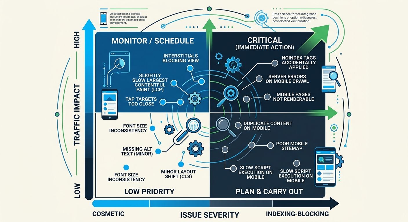
Problem 3: The audit surfaces dozens of issues but nobody knows what to fix first. Prioritize with a two-axis framework: traffic impact (how much organic traffic does this page receive?) crossed with severity (does this issue prevent indexing, degrade performance, or affect only aesthetics?). Fix indexing-blocking issues on high-traffic pages first. Cosmetic issues on low-traffic pages go to the backlog. If you want a more structured approach to diagnosing traffic drops, the SEO debugging pyramid framework provides a useful triage sequence.
Where the Data Lands Today
Google fully transitioned to mobile-first indexing years ago, yet the agencies I evaluate keep making the same mistake: they audit on desktop, propose fixes based on desktop rendering, and then wonder why rankings don't recover. As of February 2024, 65.89% of global organic searches happen on mobile devices. That percentage has only climbed since.
The small screen optimization checklist above takes 3–4 hours and produces a document that most agencies don't deliver unless you specifically request it. I've reviewed proposals from over 200 agencies across 12 years of consulting, and fewer than 30% include a mobile-specific content parity analysis as part of their standard audit offering. The rest check the "mobile-friendly" box in Google Search Console and move on to backlink campaigns.
If you're evaluating an agency for ranking recovery work, ask them one question before signing anything: "Show me the desktop-to-mobile content gap analysis for my top 20 pages." If they can't produce it, or if they don't understand what you're asking, you've learned everything you need to know about how thorough their mobile SEO audit framework really is. The nine steps outlined here give you the baseline to verify whether the agency you're paying is doing the work that matters on the version of your site that Google actually reads.
Marcus Webb
Digital marketing consultant and agency review specialist. With 12 years in the SEO industry, Marcus has worked with agencies of all sizes and brings an insider perspective to agency evaluations and selection strategies.
Frequently Asked Questions
- Why does Google rank my mobile site differently than my desktop site?
- Google indexes the mobile version of your site, not the desktop version. If your mobile pages have less content, missing schema markup, or fewer internal links than desktop, those missing elements are invisible to the ranking algorithm and will negatively impact your rankings.
- What is content parity in mobile SEO and why does it matter?
- Content parity means your mobile pages contain the same content, headings, structured data, and internal links as your desktop pages. A UK travel agency lost 55.5% of mobile rankings due to mismatched content between versions, costing $133,200 monthly in lost revenue.
- What are the three Core Web Vitals mobile thresholds I should target?
- The mobile Core Web Vitals thresholds are: Largest Contentful Paint (LCP) under 2.5 seconds, Interaction to Next Paint (INP) under 200 milliseconds, and Cumulative Layout Shift (CLS) under 0.1. These metrics determine your page experience quality score for ranking purposes.
- How far apart should clickable elements be on a mobile page?
- Any two tappable elements should be at least 8 pixels apart. If they're closer together, users will mis-tap and Google will interpret this as a usability failure that negrades ranking signals like bounce rate and time on page.
- What specific screen widths should I test for responsive design?
- Test at five widths: 320px (older phones, 4% traffic), 375px (iPhone SE/12 Mini, 18% traffic), 390px (iPhone 14/15, 22% traffic), 412px (Samsung Galaxy S, 19% traffic), and 768px (tablets, 8% traffic). Single-width testing misses 20-30% of layout bugs.
- How do hamburger menus affect my mobile SEO?
- Hamburger menus hide internal links from immediate view, reducing the crawl paths Googlebot sees when indexing your mobile site. If your desktop menu exposes 40 links but mobile hides them behind a hamburger with only 12 accessible links, Googlebot sees 70% fewer crawl paths.
- What mobile-specific performance issues cause slow page speed?
- Common causes include hero images served at desktop resolution (2400px) to small screens, third-party scripts loading synchronously, web fonts loading all weight variants instead of just those needed on mobile, and videos autoplaying instead of using click-to-play.
- Should I test mobile SEO with a smartphone emulator or a real device?
- Use a physical smartphone, not a browser emulator. Google's mobile-first indexing documentation recommends real-device testing because emulators miss rendering quirks, touch target sizing, and actual network latency that affect real users.
Related Articles

The SEO Debugging Workflow: A Framework for Diagnosing Visibility Drops in Under 48 Hours
A five-layer diagnostic sequence (crawl, render, index, rank, click) applied in strict dependency order isolates the root cause of organic visibility drops faster than any other method I've tested across 200+ agency evaluations.

The Niche-Specific SEO Audit Checklist: Beyond Generic 100-Point Frameworks for Architecture and Design Firms
Generic 100-point SEO audit frameworks consistently hand architecture and design firm websites passing scores while those same sites lose organic visibility on the pages that actually win clients: project portfolios, case studies, and studio landing pages.

The Invisible SEO Audit: Fixing Hidden Technical Problems Before Rankings Improve
Fifty-six percent of companies now run AI-driven SEO monitoring to catch invisible technical problems in real time, according to 2026 marketing data.
Explore more topics