Mobile-First SEO Audits: The Developer's Checklist for Finding Hidden Ranking Blockers
Only 43.4% of websites pass all three mobile Core Web Vitals thresholds. Desktop? 54.6%. That gap tells you everything about where ranking problems actually live.
 Marcus Webb··8 min read
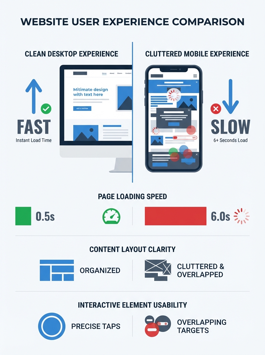
Mobile-First SEO Audits: The Developer's Checklist for Finding Hidden Ranking Blockers
Only 43.4% of websites pass all three mobile Core Web Vitals thresholds. Desktop? 54.6%. That gap tells you everything about where ranking problems actually live. I spent two weeks auditing a client's e-commerce site that had lost 35% of its organic traffic, and every single issue I found was invisible on the desktop version. The mobile experience was a different site entirely: bloated JavaScript, tap targets jammed together, an entire product comparison section hidden behind a CSS rule that Googlebot couldn't expand. The desktop audit looked clean. The mobile SEO audit told the real story.
If you're a developer responsible for search performance, your audit workflow needs to start and end with mobile. Not as an afterthought. Not as a secondary check. Mobile-first indexing means Google evaluates your mobile version as your primary site. Everything else is a footnote.
This is the checklist I actually use. Not a theoretical framework. Not a list of tool recommendations. A structured, prioritized process for finding the ranking blockers that most audits miss.
Why Your Desktop Audit Is Lying to You
Google's mobile-first indexing documentation makes this explicit: the mobile version of your site is what gets crawled, indexed, and ranked. This has been the default for years now, and yet I still see teams running their primary crawls with a desktop user agent. They're auditing a version of the site that Google barely looks at.
The consequences are specific and measurable. Content hidden on mobile via CSS display rules doesn't get indexed. Schema markup conditionally loaded only on desktop means you lose rich results. Internal links buried inside a hamburger menu that isn't in the DOM until a user taps it? Those links might be invisible to crawlers entirely.
A proper mobile-first indexing checklist starts by accepting one uncomfortable truth: your mobile site and your desktop site are not the same experience, even if you're using responsive design. Responsive doesn't mean identical. CSS media queries hide content. JavaScript loads differently on constrained viewports. Third-party scripts behave differently on mobile browsers.
The Audit Checklist, Prioritized
I've organized this in the order you should actually tackle issues. Fix the foundation first, then work your way up to the nuances.
Step 1: Crawl as Googlebot Smartphone
Before you look at anything else, run a full site crawl using the Googlebot Smartphone user agent. Screaming Frog supports this natively. So does Ahrefs Site Audit. If you're crawling as a desktop user agent, stop. You're gathering inaccurate data.
What you're looking for in this first crawl:
Pages that return different HTTP status codes on mobile vs. desktop
Pages with significantly different word counts (content parity problems)
Resources blocked by robots.txt that the mobile version needs
Redirect chains that only appear on mobile
Pages where the canonical tag on mobile points somewhere unexpected
As the team at Verkeer puts it in their technical SEO audit checklist, small mistakes in indexing configuration can remove pages from the index entirely or dilute ranking signals across multiple URLs. This is doubly true on mobile, where conditional logic in your templates can create discrepancies you never intended.
Step 2: Core Web Vitals on Real Mobile Connections
Your lab scores in Chrome DevTools are a starting point, not the answer. What matters for rankings is field data from the Chrome User Experience Report. Check PageSpeed Insights for your top 20 pages and look at the field data section specifically.
The thresholds that matter:
Largest Contentful Paint (LCP) must be under 2.5 seconds. On mobile networks with variable latency, this is harder than it sounds. The biggest wins come from preloading your LCP image, serving WebP or AVIF formats, and making sure you're not lazy-loading above-the-fold content.
Interaction to Next Paint (INP) must be under 200 milliseconds. INP replaced First Input Delay and is far more demanding. It measures responsiveness across all interactions, not just the first one. If your site loads 400KB of third-party JavaScript for analytics and ad tags, your INP is probably suffering.
Cumulative Layout Shift (CLS) must be under 0.1. On mobile, layout shifts are especially disruptive. Images without explicit width and height attributes, dynamically injected ad slots, and web fonts that cause text reflow are the usual culprits.
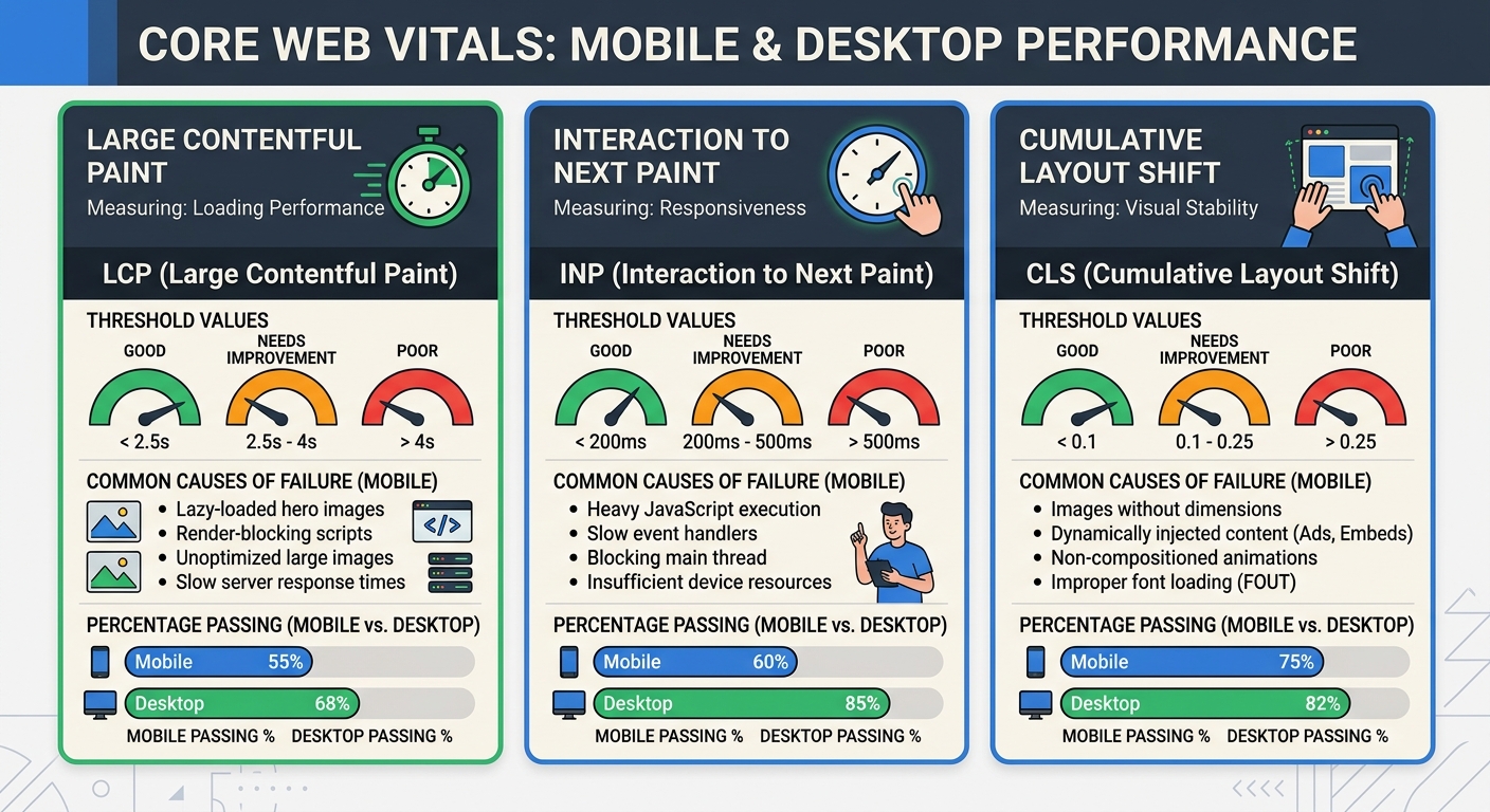
Mobile page speed optimization isn't just about making pages load faster in a general sense. It's about hitting these three specific thresholds with real user data, on real mobile connections, across enough of your pages that Google assigns you a "good" rating at the origin level.
Step 3: Content Parity Between Mobile and Desktop
This one bites people constantly. You built a responsive site, so you assume both versions serve the same content. But check the actual rendered HTML on mobile.
Common content parity failures I find regularly:
Accordion sections on mobile that contain paragraph text visible by default on desktop. If the content isn't in the DOM until a user expands it, Googlebot may not see it.
Product descriptions truncated on mobile with a "read more" link that requires JavaScript to expand.
Alt attributes stripped from images on mobile for "performance" reasons.
Sidebar content (author bios, related links, supplementary text) removed entirely on mobile.
Google is clear: the content needs to be accessible and functional on mobile devices, with clickable elements, readable fonts, and appropriate spacing. If you're hiding content to make the mobile layout cleaner, you're hiding it from the index.
Step 4: Mobile UX Signals That Affect Rankings
Responsive design SEO goes beyond just having a viewport meta tag. Google's mobile usability report in Search Console flags specific issues, and each one can suppress your rankings.
Tap target sizing. Buttons and links need to be at least 44 by 44 CSS pixels with 8 pixels of spacing between them. I've seen sites lose mobile traffic because their footer links were crammed into a 24-pixel grid. The fix takes 10 minutes. The traffic recovery takes weeks.
Text readability. Body text below 16 pixels forces users to pinch-zoom, which is a usability signal Google tracks. I recommend 16 pixels minimum for body copy with a line height of 1.5 or greater and a contrast ratio of at least 4.5 to 1.
No horizontal scrolling. Test across real viewport widths from 360 to 430 pixels. Common culprits include tables with fixed widths, images without max-width rules, and the classic mistake of using 100vw without accounting for the scrollbar.
These mobile UX signals are exactly the kind of thing that slips through a standard technical audit. They don't show up as crawl errors. They don't trigger 404s. They just quietly erode your rankings.
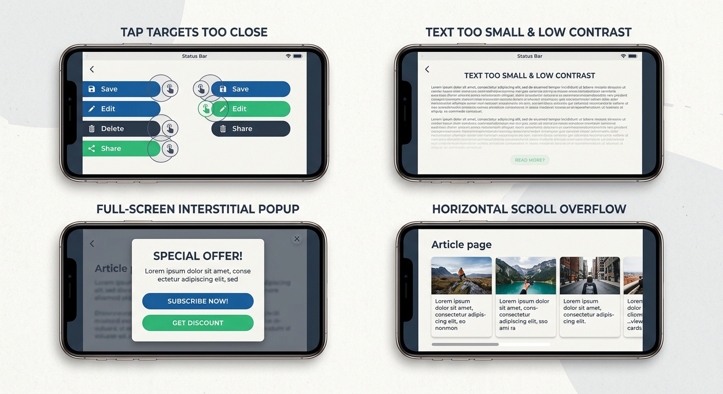
Step 5: Interstitials and Pop-ups
Google penalizes intrusive interstitials that block content immediately after a user arrives from search. As Bubblegum Search explains, you don't need to eliminate every pop-up, but you need to carefully consider whether they're blocking the user's path to content.
Full-screen overlays, aggressive email signup modals that fire on page load, and cookie consent banners that obscure the entire viewport are all problems. Small banners that use a reasonable amount of screen space are fine. Legally required interstitials (like age verification) are also fine. The test is simple: can a user see the content they searched for within a second or two of landing on the page?
Step 6: Structured Data Consistency
If your desktop pages include JSON-LD for FAQs, how-to content, product information, or review schema, verify that your mobile pages serve the exact same markup. I've seen sites where structured data was injected server-side based on user agent, and the mobile branch served a stripped-down version.
Check the raw HTML source on mobile for every page template that carries structured data. Google's Rich Results Test lets you specify a mobile user agent. Use it.
Step 7: Server Performance Under Mobile Conditions
Time to First Byte should be under 600 milliseconds, ideally under 200. On mobile networks with higher latency, a slow TTFB compounds every subsequent loading step. If your server takes 800 milliseconds to respond and then the browser needs to download, parse, and render your JavaScript-heavy page, you're looking at an LCP well above the 2.5-second threshold.
Practical fixes: make sure you're serving from a CDN with edge nodes close to your users, use HTTP/2 or HTTP/3, implement server-side caching aggressively, and audit your application's server response time under concurrent load.
The JavaScript Framework Problem
Modern JavaScript frameworks deserve their own section because they introduce a category of mobile audit issues that traditional tools miss entirely.
Single-page applications built with React, Vue, or Angular can render what looks like a 200 OK page to the browser while actually serving thin or error content. A server-side error caught by your application's error boundary might show a friendly "Something went wrong" message with a 200 status code. To Googlebot, this is a real page with almost no content. Over time, these phantom pages accumulate and dilute your site's quality signals.
If your site experienced a traffic drop after a framework update or deployment, running through a systematic process for diagnosing visibility drops can help you identify whether JavaScript rendering failures are the cause.
Also check whether your mobile navigation is actually crawlable. If your hamburger menu renders its links only after a tap event and those links aren't present in the initial DOM, you've essentially hidden your site's structure from search engines. Server-side rendering or static generation solves this, but you need to verify it's working correctly in production, not just in your development environment.
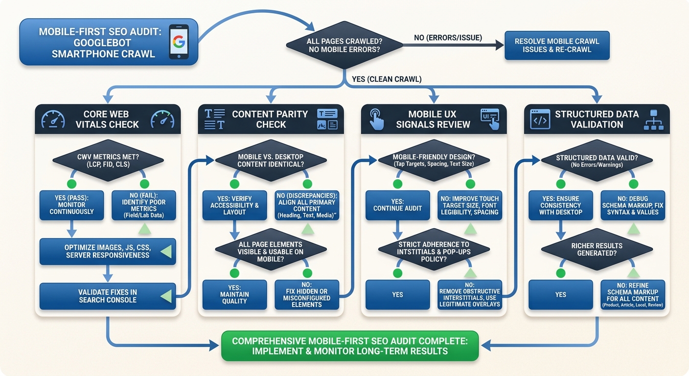
Building This Into Your Workflow
A one-time audit is useful. A repeatable process is what actually prevents ranking problems. Here's how I've integrated mobile-first checks into ongoing development:
Run Core Web Vitals monitoring weekly for your top traffic templates. When field data starts degrading, you catch it before Google does.
Include mobile user agent crawls in every pre-deployment checklist. If a code change alters what Googlebot Smartphone sees, you need to know before it hits production.
Test new features on real devices, not just Chrome DevTools emulation. BrowserStack or an actual mid-range Android phone will reveal performance problems that emulation masks.
Audit third-party scripts quarterly. Tag managers accumulate scripts over time, and each one adds JavaScript that affects INP and LCP on mobile.
If you're managing technical SEO across a larger organization, the March 2026 core update analysis provides good context on how Google is weighing these mobile signals in its most recent ranking changes. And for teams building or rebuilding sites, getting the site architecture right from the start prevents most of the mobile parity issues I've described here.
The Practical Takeaway
By the end of your mobile SEO audit, you should have a concrete list: specific broken links, duplicate pages, slow pages with identified causes, and mobile formatting problems. Not vague recommendations. Not "improve page speed." Specific items like "hero image on product template is 1.8MB, causing LCP failure on 340 URLs" or "tap targets in category filter are 28 pixels with 4-pixel spacing."
The Mobile SEO Checklist for 2026 covers many of these items, and tools like Seomator's audit tool can automate the initial discovery. But the developer's job is interpretation. Tools find symptoms. You diagnose root causes and prioritize fixes based on traffic impact.
Start with the Googlebot Smartphone crawl. Compare it to what you expected. The gap between those two things is where your rankings are hiding.
Marcus Webb
Digital marketing consultant and agency review specialist. With 12 years in the SEO industry, Marcus has worked with agencies of all sizes and brings an insider perspective to agency evaluations and selection strategies.
Explore more topics